Project Overview
One of the first projects Joel Dunn hired us for was to created a visual identity for the youth group he oversaw at a church in Los Angeles. He had seen a sketch of a tree we had done and wondered if that could be used for his group, which he called, “Rooted.” That first sketch and type treatment turned into four seasons represented by the tree. And then the rough, grunge version turned into a more abstract, clean version of the concept, which was used for several years before Joel moved to a different position at a different church.
Client and Location
Joel Dunn / St. John’s Presbyterian Church in Los Angeles, CA
My Role
Ideation and Design
Project Duration
One month from concept to delivered files
The original tree sketch
Everything had a textured feel and lots of color. Joel used this logo for presentation slides and game ideas and all manner of youth-related activities.
But after using for about a year, he asked if I could revisit the concept to create something more usable and flexible. Though the grunge look was fun, it started to feel dated. So we took the concept and cleaned it up.
The modified tree with added grunge type treatment
THe revised version
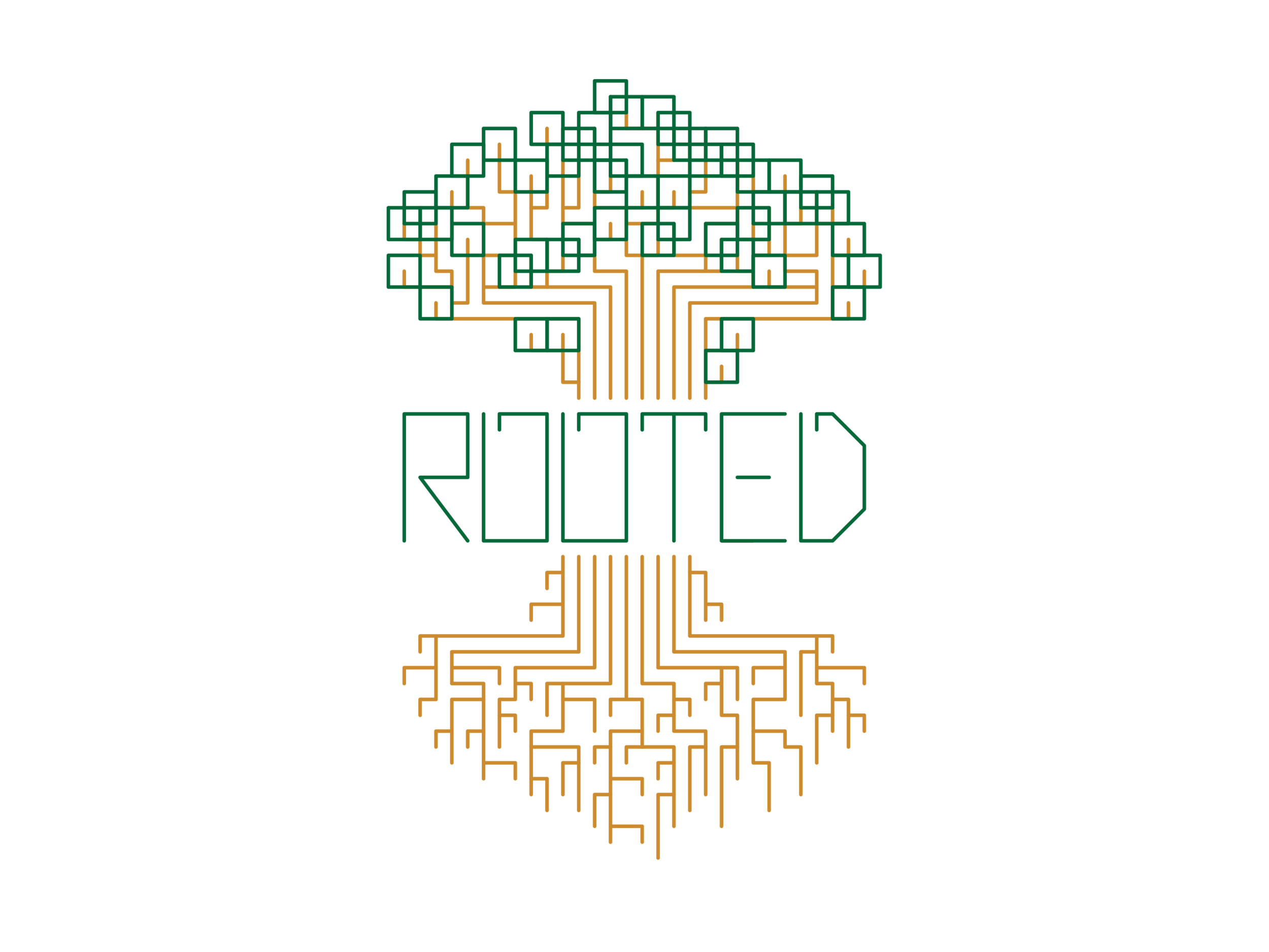
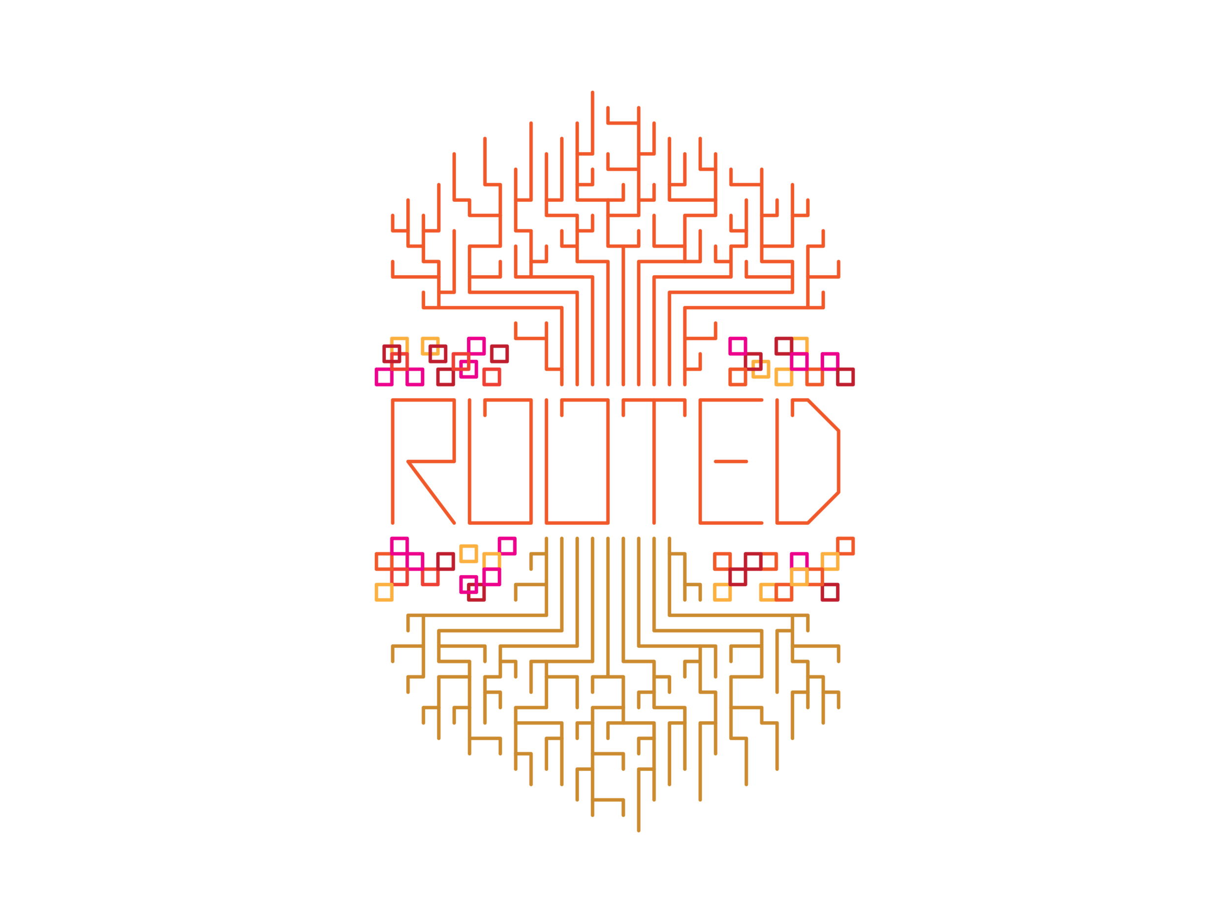
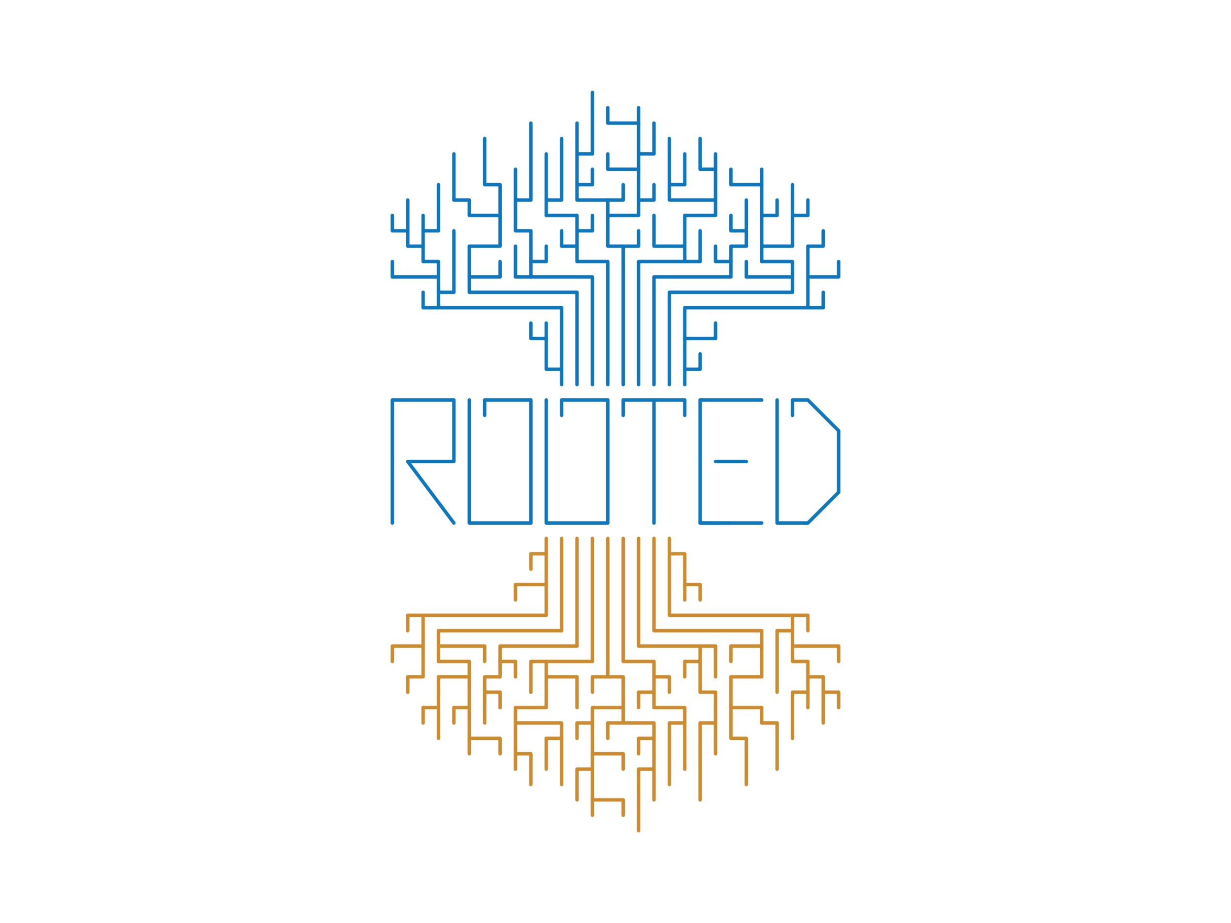
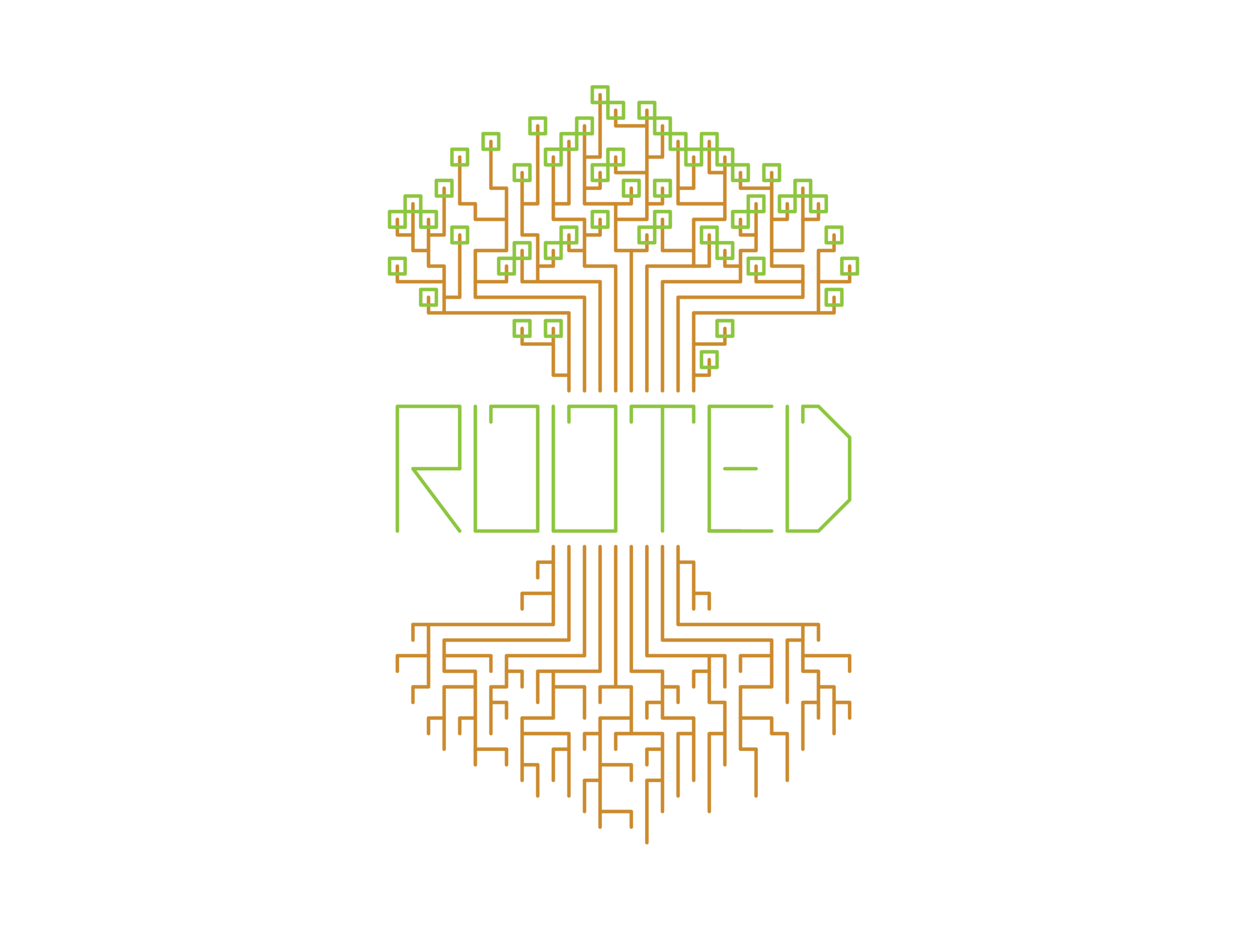
An animated gif of all four versions covering the whole year.
Cleaning this up to be a more abstracted, less hand-drawn version of the tree proved very beneficial for Joel and his program. The students loved it, as did his supervisors. He utilized it as he had the old version but with even more variety, up until he moved to a different position at a different church.
This became the main version of the identity with the other seasons used for special occasions throughout the year


