
Project Overview
Perfect Properties is a responsive web app created with a mobile-first methodology that is meant for new, small-scale buyers to find pertinent information about properties of interest, add filter criteria to narrow their search, and get in direct contact with the seller or realtor.

My Role
User flows, UI Design, Interactions, Gestures, Prototyping, and Branding
Project duration
3 months
Explore for Yourself
Who is our user and what do they need?
Most of the research into who are user is and what they need was done by the research team before we started the project. In brief, our primary user is Rashida, and here are a few things about her:
She makes a good money at her job and is looking to invest in real estate as a means of providing financial security for her family.
She is very tech savvy but new to real estate.
Her schedule has her often on the move, so she needs apps that function smoothly and make complex things clear and simple so that she doesn’t waste her time.
What does Rashida need to accomplish her goals?
The ability to create a profile and select property criteria so that the app can provide accurate recommendations for her.
Filter capabilities when conducting searches in order to narrow down her results even further and save her time.
A way to mark or save properties that she’s interested in so that she can quickly find them again for more in-depth review.
Clear, concise information about the properties and a means to contact the person selling.
To meet those goals, what steps would she need to take?
Task 1 - Analysis & User Flow
Create a profile containing all her property criteria
Starting Point: Open her browser
Go to web app URL
Login or Sign up
Set up her profile with all of her property criteria
> Location
> Type
> Price RangeGo to Homepage and see properties that match her criteria
User Flow - Click to Expand
Task 2 - Analysis & User Flow
Search for and filter properties that match based on her needs
Starting Point: Homepage (where the properties are already showing based on profile criteria
Add filters to narrow down the search results
Peruse filtered results
User Flow - Click to Expand
Task 3 - Analysis & User Flow
Save / Mark Properties that she is interested in to a list that she can quickly and easily access later
Starting Point: Any property card listing
Tap “Save for Later” Bookmark icon on property card
At any point, tap on “Saved” navigation icon
View properties that have been bookmarked
User Flow - Click to Expand
Task 4 - Analysis & User Flow
Access all of the written and visual information associated with the properties she is interested in reviewing
Starting Point: Search / Saved Properties / Any Property Card
Click on specific property to view the information
User Flow - Click to Expand
Task 5 - Analysis & User Flow
Contact the Realtor / Seller to schedule a viewing
Starting Point: Any property information page
Tap on Floating Action Button: “Contact Seller”
User Flow - Click to Expand
Moving into Initial Design with Low-fidelity Wireframes
We chose a mobile-first approach with the design in order to keep Rashida’s needs and goals at the forefront. Since she is on the move most of the time and already using her phone to coordinate so much of her life, it logically follows that she will primarily access this from her phone.
Sketching out the first draft of how the web app might look started with a navigation bar anchored at the bottom of the screen. It included links to a Rashida’s profile, her saved properties list, a general search for looking through properties beyond her profile-specified criteria, and a place to engage with her curated community in order to gain and give property recommendations.
The primary goal would be for existing users to log into their accounts or for new users, like Rashida, to sign up for an account, which would take her through a selection of property criteria to narrow down what the web app would recommend for her.
Whether refining the recommendations or sorting through a general search or even sorting through her saved list of properties, Rashida would be able to pull up filter options to narrow down what she is seeing, thereby limiting her cognitive load.
And anytime a property card is on the screen, whether in search results or when Rashida has tapped through to find out more about the property, a bookmark icon would always be present to allow her to save properties of interest, with a modal window appearing briefly to confirm that she has added that property.
Next we refined and iterated the screens
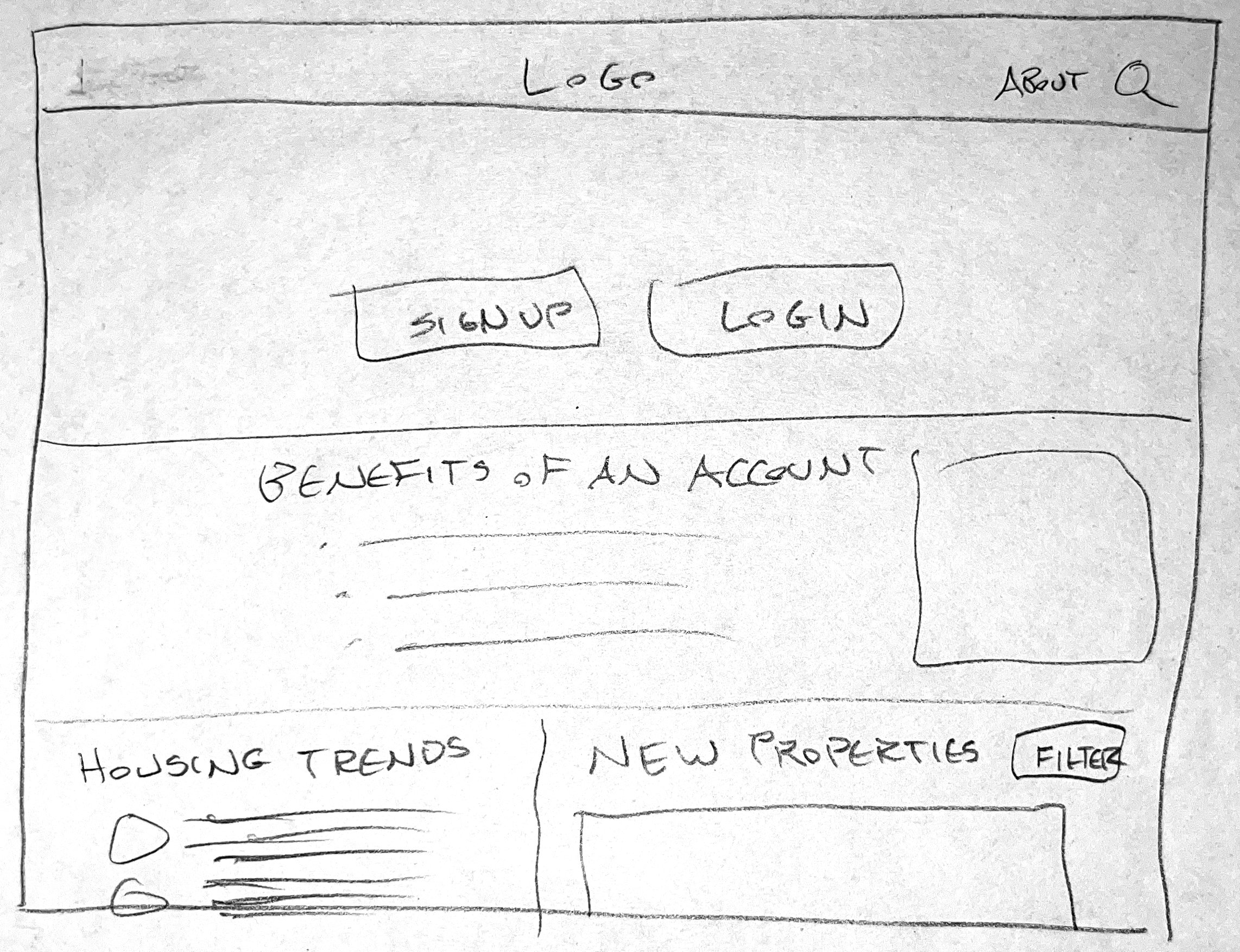
The Splash Screen
Though the initial sketches had the “Log in” button on top, we realized the primary visual element on this screen needed to be the “Sign Up” button to draw in new users. Existing users would already be familiar with the structure. As the iterations progressed, we added in color, imagery, and icons (more on that later).


The Sign up Screen
In order to keep things quick to comprehend for Rashida, we started with a 4-column grid system horizontally and a 4 pixel grid vertically. This helped keep the layout clean and simple.
We kept the language, input field prompts, and button text simple and concise. Color was added with contrast in mind for easy readability. Added iconography was created with simplicity in mind as well, meant to make the screens easier to scan through quickly.


Property Criteria
Moving from sketched wireframes to digital wireframes, we wanted to keep the property criteria screen straightforward, limiting to selections for location, price, and type. Based on the user research done for this project as well as some additional research into real estate trends, this made the most sense and worked well with the grid system in place.


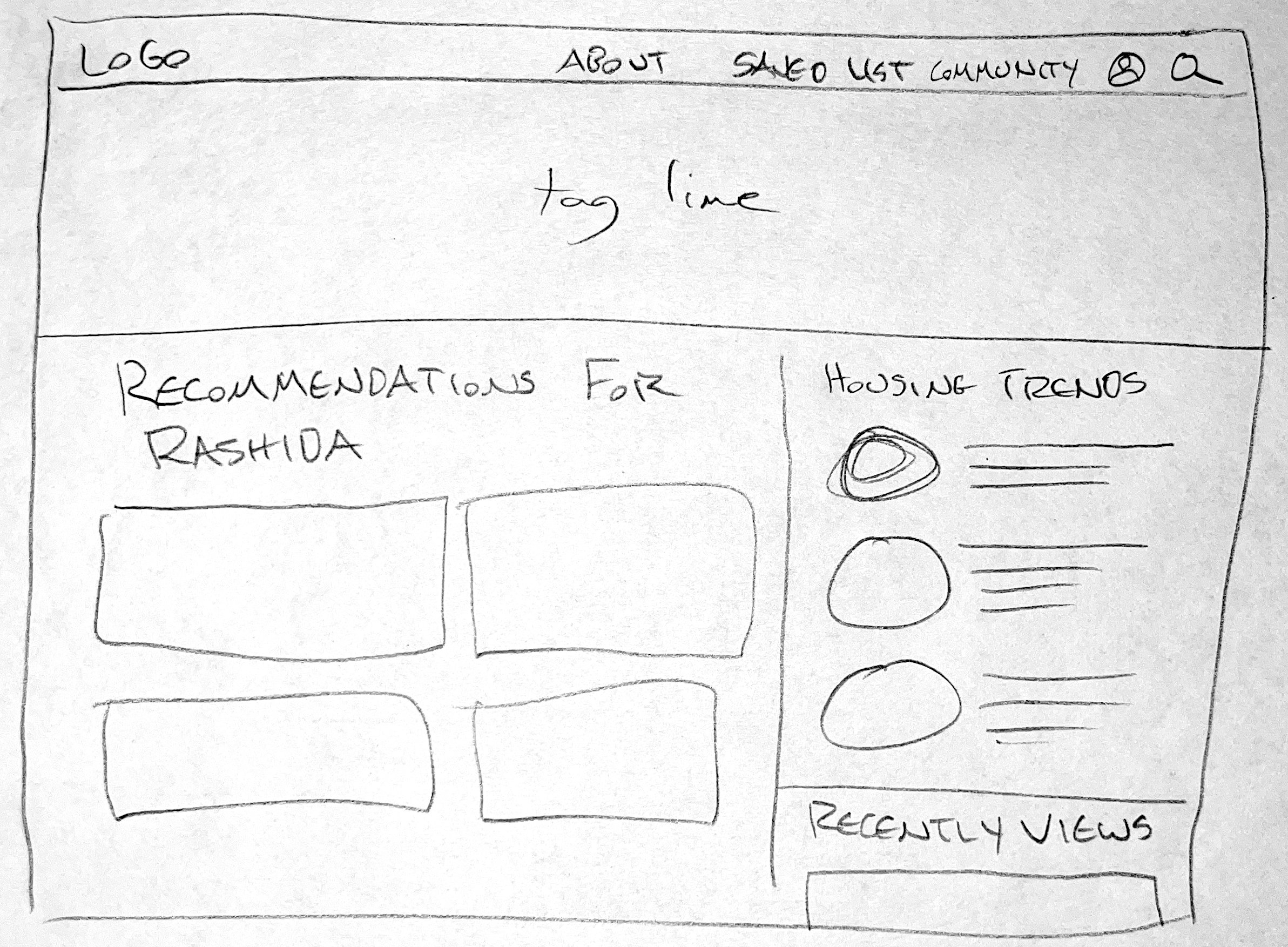
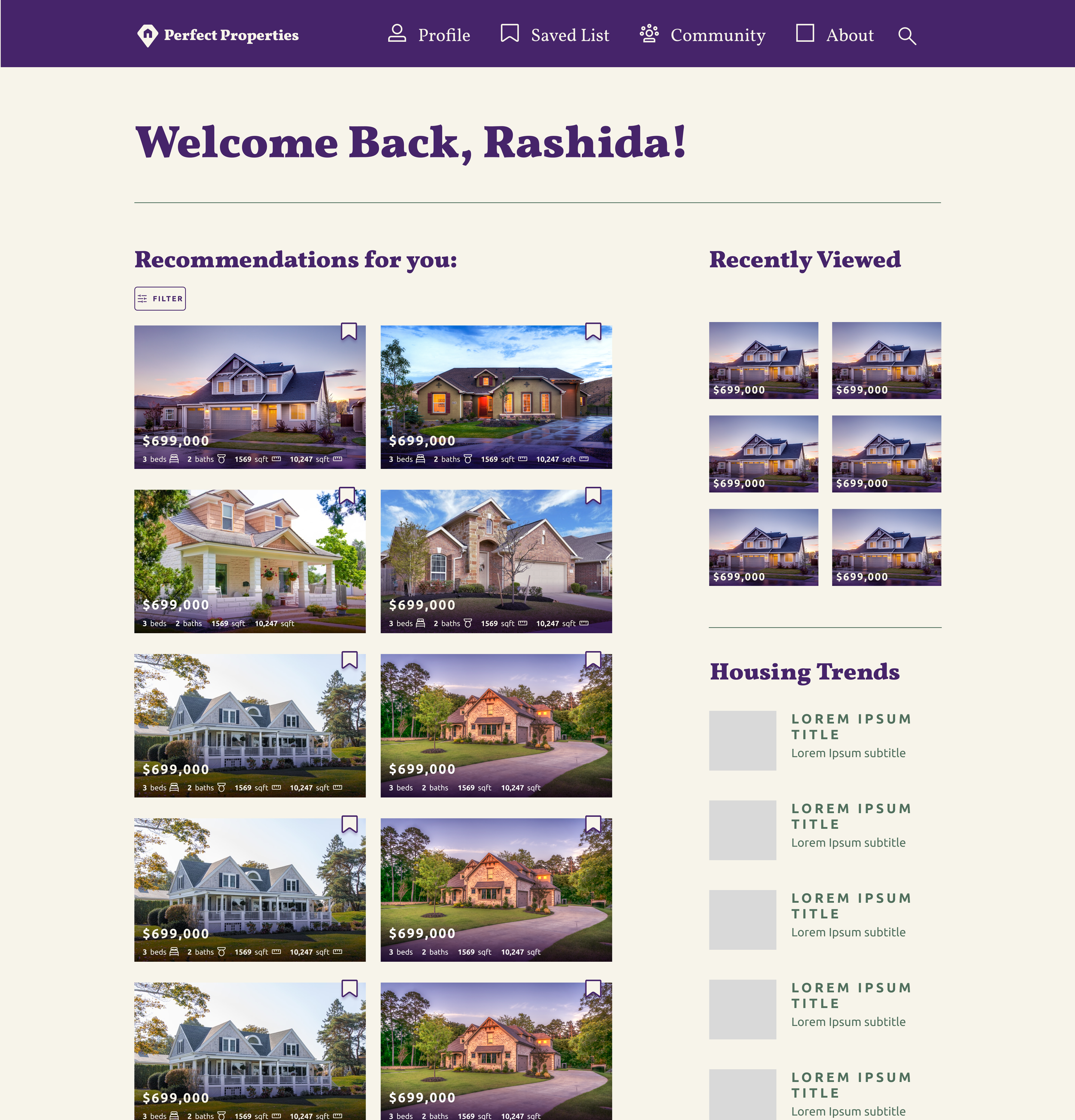
The Dashboard
It quickly became apparent that the bottom navigation bar was taking up too much valuable space. It made more sense for Rashida if we utilized a hamburger menu, making it still easily accessible for her as a tech-savvy individual and allowing her to see properties recommended for her right away.


The Filter Menu
Laying this out digitally revealed that the options we wanted to include could all easily fit onto one screen, instead of needing two. We’ve made note though that as filter options are added in the future, we would need to add in a scrollable interaction. On the initial sketches, we did not include a button of any sort at the bottom, but we saw that without it, Rashida, or any other user would not have a clear path to seeing the filtered results.


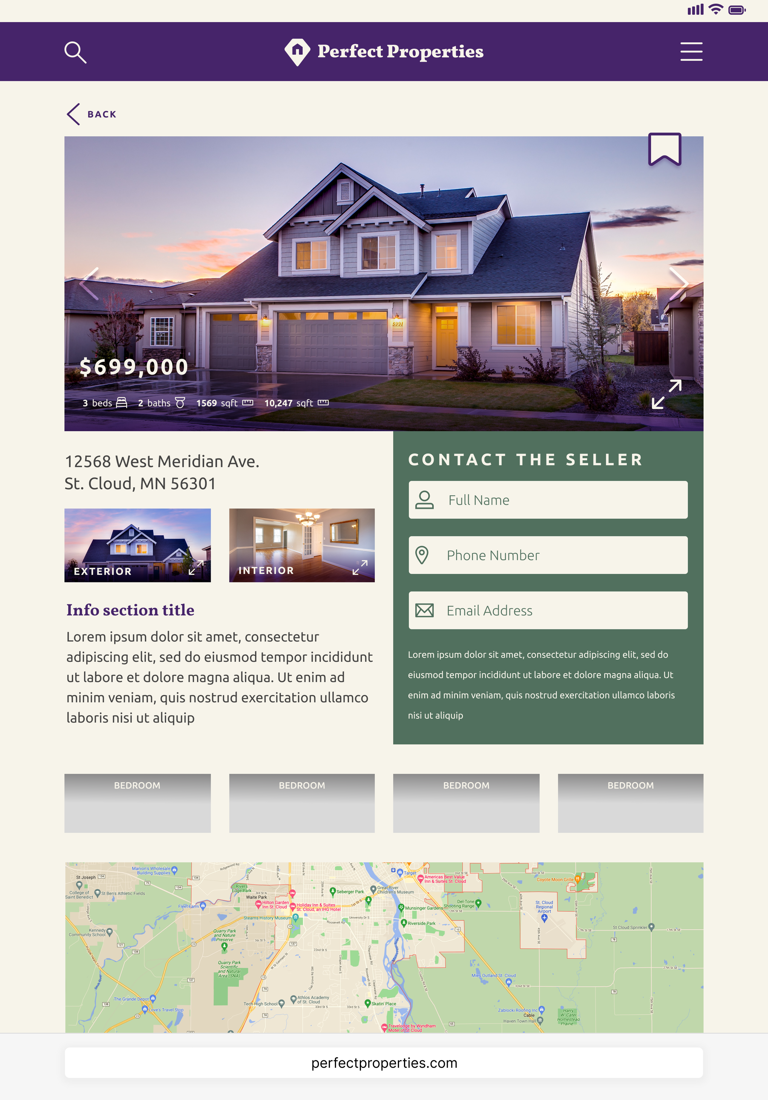
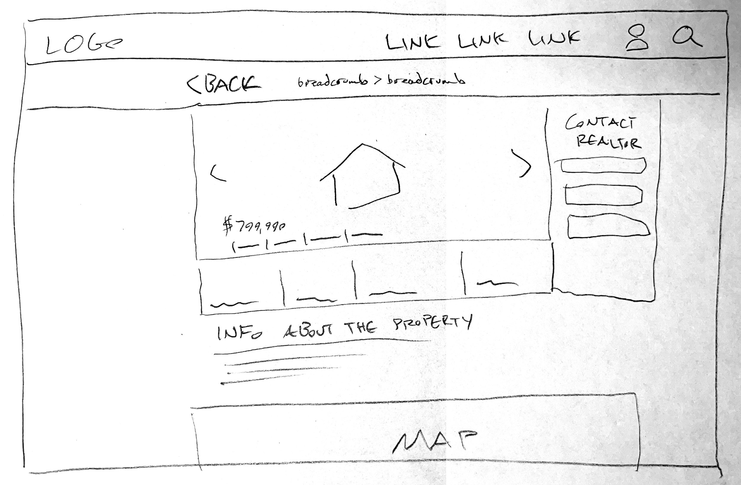
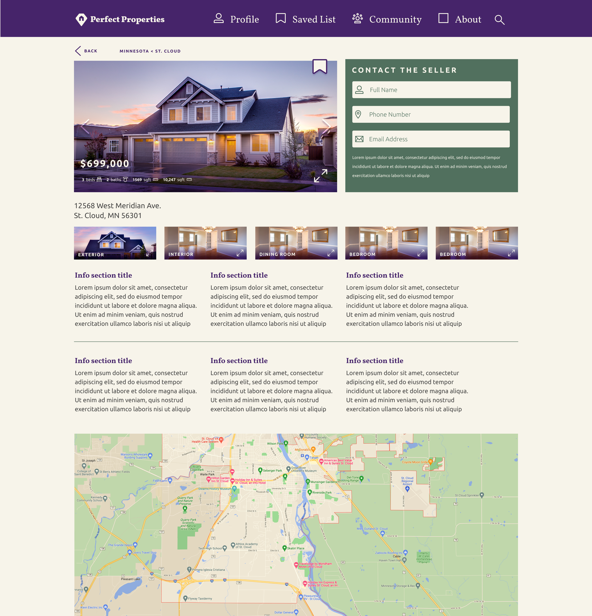
Property Info Screens
Arguably, these screens will see the most change over the life of the app. As more properties are added and as users like Rashida become more seasoned investors, the displayed content will continue to be refined. We’ll keep asking, “What is crucial so that our users can make a well-informed decision about each property?”


Moodboards and Style Guides
Before we had moved from the initial digital screens to adding color and type, we created moodboards to explore what direction to take.
Ultimately our first moodboard is what we adopted and implemented as we moved forward. It matched up with the user research well and carried an air of prestige and respectability with a modern accent.
The strong, dark purple has a suggestion of nobility and boldness, while the greens speak to growth and wealth.
With the moodboard as a guide, we developed a library of icons, a more extensive color palette, and typography guidelines. The project started with limited branding set in place, so we also developed a logo and guidelines for how it should be used throughout the app.


Examples of Interactive Elements
Property Criteria Button Animation
Hamburger Menu Animation
Search Bar animation
Filter Menu Animation
Loading Animation
Saving Animation
Breakpoints for Tablet and Desktop
Much of the work for the overall structure and interface was done for the mobile breakpoint, so we then applied that structure and interface for tablet and desktop breakpoints as well.
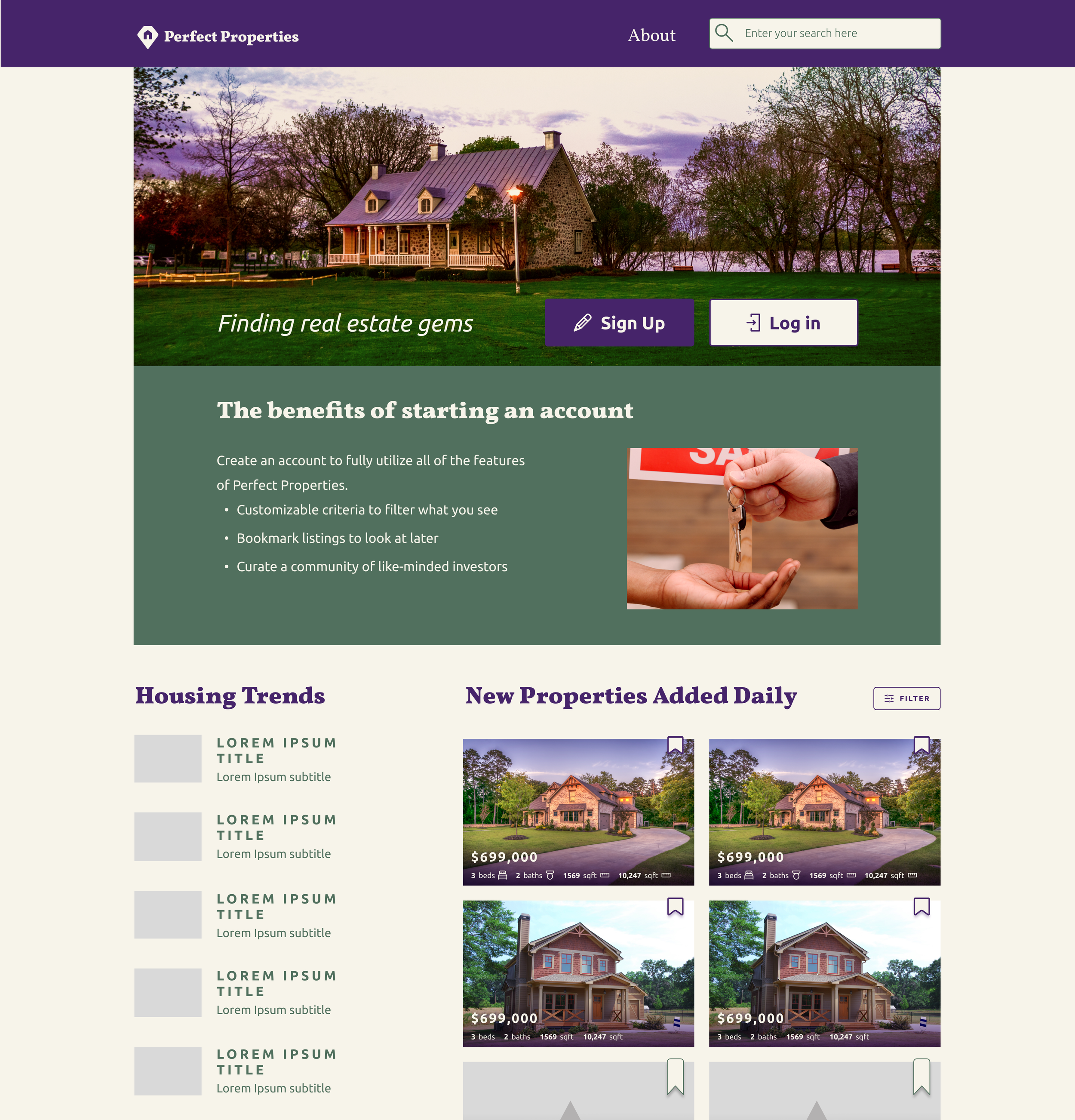
In creating the landing pages for the tablet and desktop layouts, it became apparent that several things would have to be different from the mobile interface:
New users might want to know why they should sign up for an account, so a list of benefits would be important to include.
The navigation menu would need to be limited because most of the app features are meant to be paired with an account.
On the dashboard layouts, we made several structural changes and additions to the included content:
A section for “Housing Trends” and news was added since these larger breakpoints would be more conducive for in-depth research.
More properties could be displayed at once in multiple columns. The tablet breakpoint could utilize horizontal scrolling for the recommended properties, whereas the desktop layout would just have vertical scrolling.
A “Recently Viewed” section was created to highlight properties that Rashida had looked at briefly but had not decided to add to her Saved List yet or had not had time.
On the property info pages, aside from the increased amount of information that can be visible at once, we added a contact form to allow Rashida to get in touch with the realtor or seller of the property.


Future Planning and Development
There are more user flows to be created and features to be mapped out, especially for the larger breakpoints, but for now the Perfect Properties web app is in a holding pattern before development can begin.