
Project Overview
Lively is a health and wellness app that can be used to find highly-rated health care providers, exercise and diet plans, and a variety of community support groups in a local area. It also allows for people to upload and store their important medical documents, keep track of appointments and medications, and generally craft their own plan for improving their overall state of health.
My Role
UX Research, UX Design, Usability Testing, UI Design, Branding
Project duration
8 months
Explore for Yourself
The Problem to solve
Initially, we thought that Lively would be best suited for people caring for others (mothers caring for children, adults caring for aging parents, and so on), so our crafted problem statement read like this:
Our caretakers need a secure way to keep track of their personal medical information (documentation, appointments, medications, therapy sessions, vaccination records, etc.) as well as those in their care because their own sense of health and mental wellbeing is tied to and improves alongside their caring well for others.
We will know this to be true when we see that caretakers are using the web app to store their own medical information and the medical information of those in their care, tracking items on a regular basis.
As we moved into further research with competitive analyses and user interviews, our understanding of the problem shifted.
Gaining Insight Through Research
We arranged a series of interviews with several different types of caretakers, each with unique personal experiences navigating different parts of the healthcare systems of Southern California. We started with three main goals.
GOAL #1
To better understand user behavior habits involving caring for their own health and those in their care.
GOAL #2
To discern how users choose to track their medical information and their general health status.
GOAL #3
To document any known points of friction that users may have with existing web apps centered around health and well being.
From these interviews we gleaned several important insights:
It is very difficult is for a caretaker to navigate the current healthcare system in the USA on behalf of someone else, especially in light of HIPAA privacy laws.
There are multiple medical systems in use within our healthcare system, they don’t always work well together, and patient information within them does not always get entered accurately nor get shared in a timely manner.
A potentially overlooked part of the market are people that have opted for medical bill sharing programs so that they can handle their care all themselves and choose whom they’ll see.
We gathered all of the information we learned and worked through two rounds of affinity mapping to pull out some additional patterns and themes.
Affinity Map Round 1


-
• As part of caring for their health, people need community that understands what they’re going through so they don’t feel alone.
• People also need empathy from their care providers.
• Because of the number of roadblocks and the amount of red tape within the health care system, users will resort to tracking their medical information in their own ways.
• As one participant said, “Tangible knowledge is power.” Providing a wide array of educational resources for users puts control back into their hands when they can’t get answers from the health care system.
• In order to navigate the healthcare system, having means to directly contact doctors or specialists greatly reduces frustration and stress for users.
Affinity map Round 2


-
• Technology and Accountability work well together towards improving a user’s physical health
• Community and connection plays a big role in improving Mental health.
• It’s important to be sensitive and understanding concerning mental health stigmas in order to break down barriers to better health.
• Medical Information needs to be keep track of accurately, whether by the HCP or by the user. If inaccurate, there needs to be recourse to fix the errors.
• HIPPA laws currently make it difficult to obtain permissions for caretakers. Security for medical information is important but needs to not become a hindrance to the patient OR the caregiver in order to obtain necessary help.
• A potential market gap is those who use medical bill sharing services instead of health insurance. It allows a certain measure of freedom and initiative for the users to handpick their care.
• Allowing people the ability to craft their care puts them back in control so that they can navigate through a broken healthcare system.
• Users should be able to then share the resources they’ve found with others and develop some community in the process.
Empathizing With our Users
After analyzing our interviews and the insights gained from affinity mapping, we crafted two main personas and created journey maps that would inform our user flows and the information architecture of our web app.
Our primary user persona, Mallory
Mallory’s Journey Map
Mallory’s User Flow searching for migraine treatments
Our secondary user persona, James
James’ Journey Map
James’ User Flow looking for new physical exercises
From the journey maps and user flows, we laid out an initial sitemap. To get more perspective on our chosen categories, we performed an open card sort with 10 participants using Optimal Workshop. The results validated many of our decisions, but we noted that many people placed “Support Groups” in a similar category as “My Community Profile.” So we revised the sitemap to reflect that before moving on to wireframing.
First draft of the sitemap for Lively
Second draft of sitemap for Lively, after a card sort
Low-Fidelity and Mid-Fidelity Wireframes


After sketching out initial ideas for some of the main features of the web app, we realized that the “Find a Resource” section would be very limited and not scale as well as more content was added later on in the process. So we took that into account as we did more sketches of the user flows, looking specifically at how search filters could be applied to both the “Find a Doctor” and “Find a Resource” sections, how someone would check reviews for given search results, and how it might look to search for exercises.


Working through the user flows in greater depth led us to further revise the sitemap to better show the information architecture of the web app.


First Round of Usability Testing
With a clickable, interactive prototype, a test plan and script, and several willing, well-informed participants, we began our first round of testing to see how intuitive our web app was so far and what could be improved. As each participant’s test was completed, we gathered our data and started affinity mapping again, similar to how we analyzed our interviews earlier. This time though, we compiled our affinity map data using a rainbow spreadsheet method and then made revisions to our prototype before delving into the visual interface in greater detail.


Amended Prototype based on the Usability Testing Report
Old Screen

Issue 1
Confusion between three main navigation titles (Severity: HIGH)
Implemented Solution:
Adjusted navigation titles to better clarify what content to expect in each section and highlighted home icon so that users know when they are on the dashboard (important for older users)

Old Screens

Issue 2
Participants were more interested in star ratings, but not the reviews (Severity: MEDIUM)
Implemented Solution:
Easily scannable star ratings show in initial search results and instead of full-blown reviews, we give that space to informal comments.
Additional Issues and their implemented solutions:


Considering the visual design and user interface
We ran a quick preference test between two proposed color palettes and had over 40 participants respond. 79% favored one palette over the other, so we began implementing it throughout the whole web app.
We also added in a custom script wordmark for the Lively brand, and friendly, flat color illustrations.


We researched several visual guidelines from Google’s Material Design and adopted several component styles to improve the overall consistency and legibility of the user interface as we refined each screen. Over the next few iterations, we adjusted the colors on several items to improve the contrast and readability, considering that many of our potential users may have some visual impairment.
Onboarding Flow


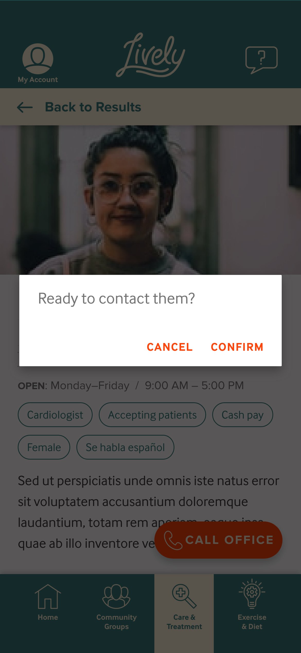
Care & Treatment Flow - Formerly “Find a Doctor”


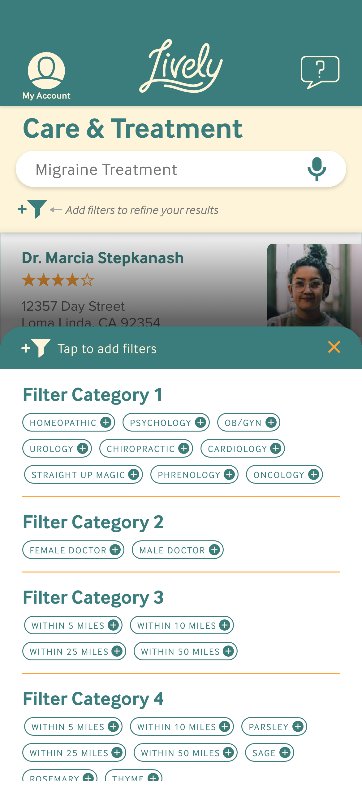


It became apparent that as Lively would scale and increase its content, we needed not only a clear way to display varied search results, but also a simple way to add content, regardless of what it was. So a card system made a lot of sense, paired with a chip component for the many categories. That way, things could be added or removed without having to re-invent the whole structure every time, the development budget wouldn’t become unrealistic, and the filter menu could help the cognitive load facing our users as they searched through content.
Utilizing the floating action button allowed us to keep a core user concern (direct contact with doctors) at the forefront as well.
Sign-Up Flow - If Onboarding was skipped


We crafted a design language system to help guide future developments and decisions regarding the visual side of Lively. That can be accessed here:
Peer Feedback and Addressing Accessibility
Several colleagues critiqued the more polished version of the prototype and provided new insights to consider for future iterations. We took those into consideration as we also looked for ways to make the overall design more accessible for those with visual impairments. Primarily we increased type sizes a few points and darkened text prompts that had been lighter grey in order to improve contrasts. We replaced our initial navigation icons with more universally recognizable icons and added icons to numerous areas where better visual clarity was needed.


Improving Lively in future developments
The initial problem statement and solution put the focus on a need for our users to securely store medical information. But as we explored the problem, we learned that the main issue was creating means for our users to take back control of crafting their health care plan. While that still included needing a way to keep track of their medical history and documentation, it also meant finding ways to connect with community and health care providers and learning what other options might be available to them.
As we move forward with Lively, we will continue to develop the Community Groups feature and build out what is available within the My Account section to better serve the needs of our users.