
Project Overview
In the fall of 2017 the directors at Camp Pondo approached me about designing themed artwork for their 2018 summer program. The concept was going to be called, "Get a Clue," hinting at a detective-style theme. It would need to work in digital, physical, and environmental formats and be expandable into undecided team names that future guests would be a part of once the weeklong events started in the summer.
Client and Location
Dan and Becky Skipper, Camp Pondo in Green Valley Lake, CA
My Role
Ideation, Lettering, Artwork, Implementation
Project Duration
Artwork: 2 months / All Deliverables: 1 month
The Initial Sketches
Early Exploration
These were interesting ideas but it was clear they would not adapt well for the variety of uses. Given the time and budget restraints, these ideas were not pursued any further.
Visualizing several directions
Making Progress
The interlocking play of the letters showed promise, so the concept was advanced to digital iterations to see how flexible it could be before presenting it to Dan and Becky Skipper who generally preferred seeing a more polished concept before approving the direction.

Working out a viable solution
The Digital Version
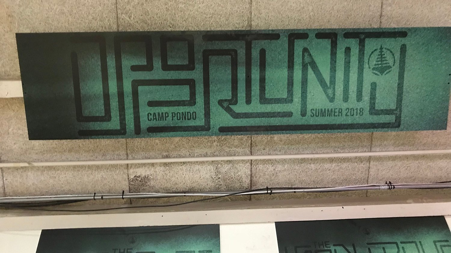
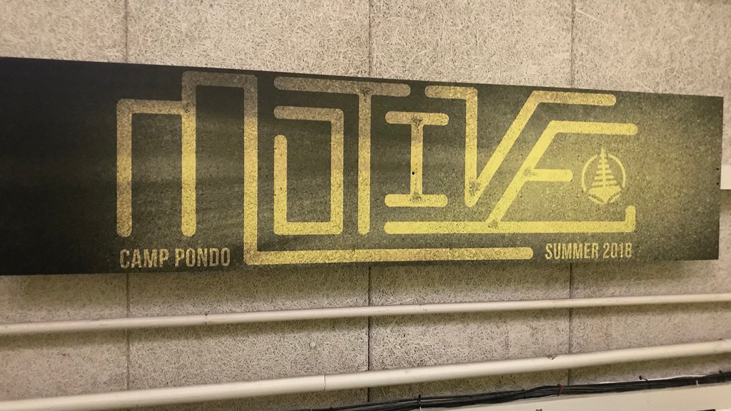
That concept evolved into a style that would involve custom lettering creating a maze of possible routes with an added magnifying glass searching for clues. I presented it to the Skippers, who loved it and gave me the green light to start working this style into all of the deliverables they would need.
Now we’re getting somewhere (click image for a closer look)
Creating all the Deliverables
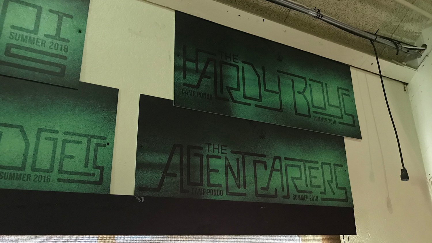
After the initial artwork direction was designed and approved, there was a long list of ways it needed to be used and modified to fit the summer program that the Skippers were creating for the camp. Some items were simple presentation screens (like the social media one below) or prepping the artwork files for a sign vendor to make an extruded version for the main meeting space at the camp (complete with an actual magnifying glass).

Adjusting the lettering for each occasion proved to be a fun exercise in balancing positive and negative space
The physical sign that Dan commissioned utilizing the artwork I had created
But to help with organization, the Skippers needed several more things created before guests arrived:
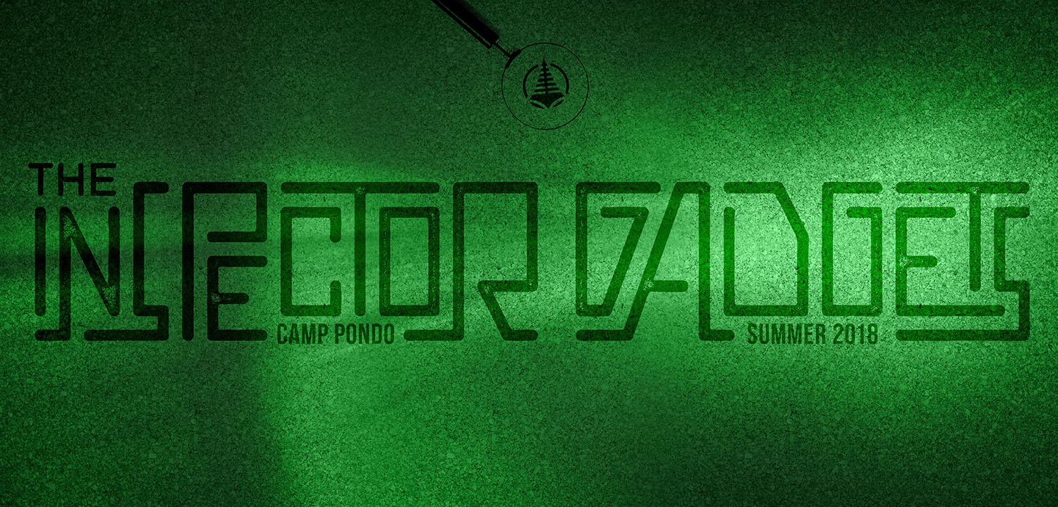
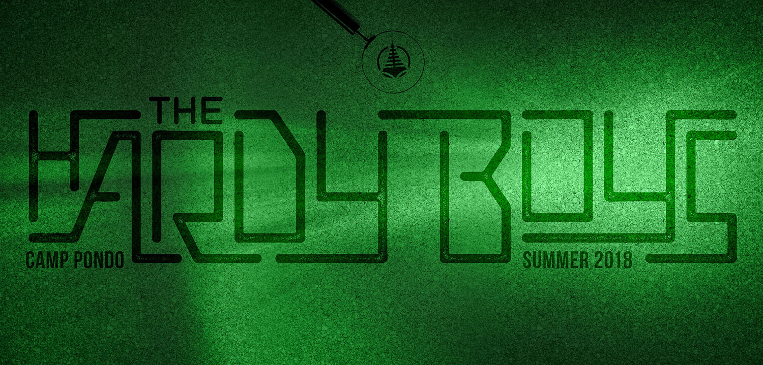
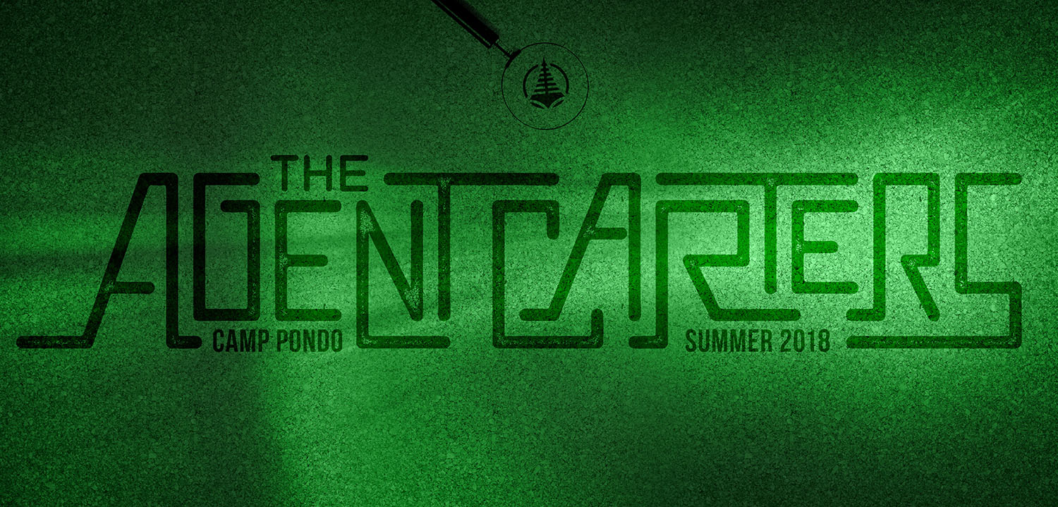
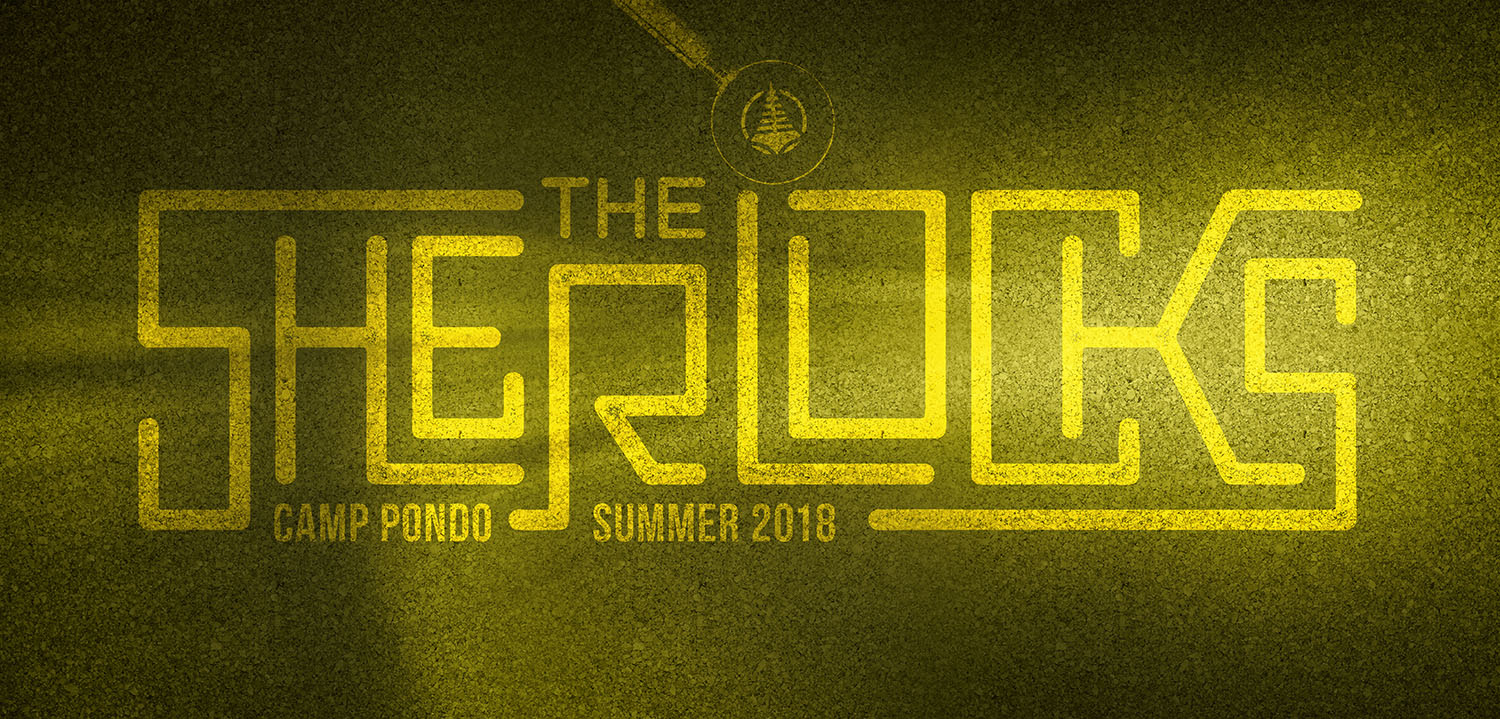
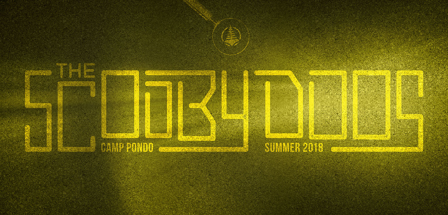
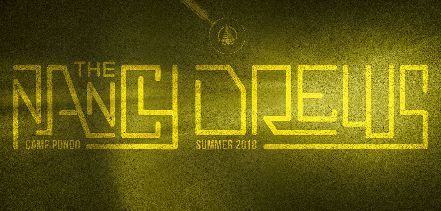
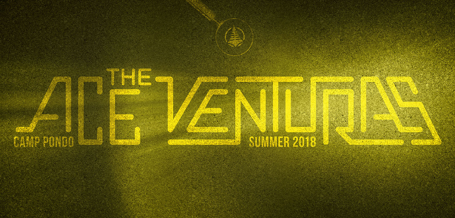
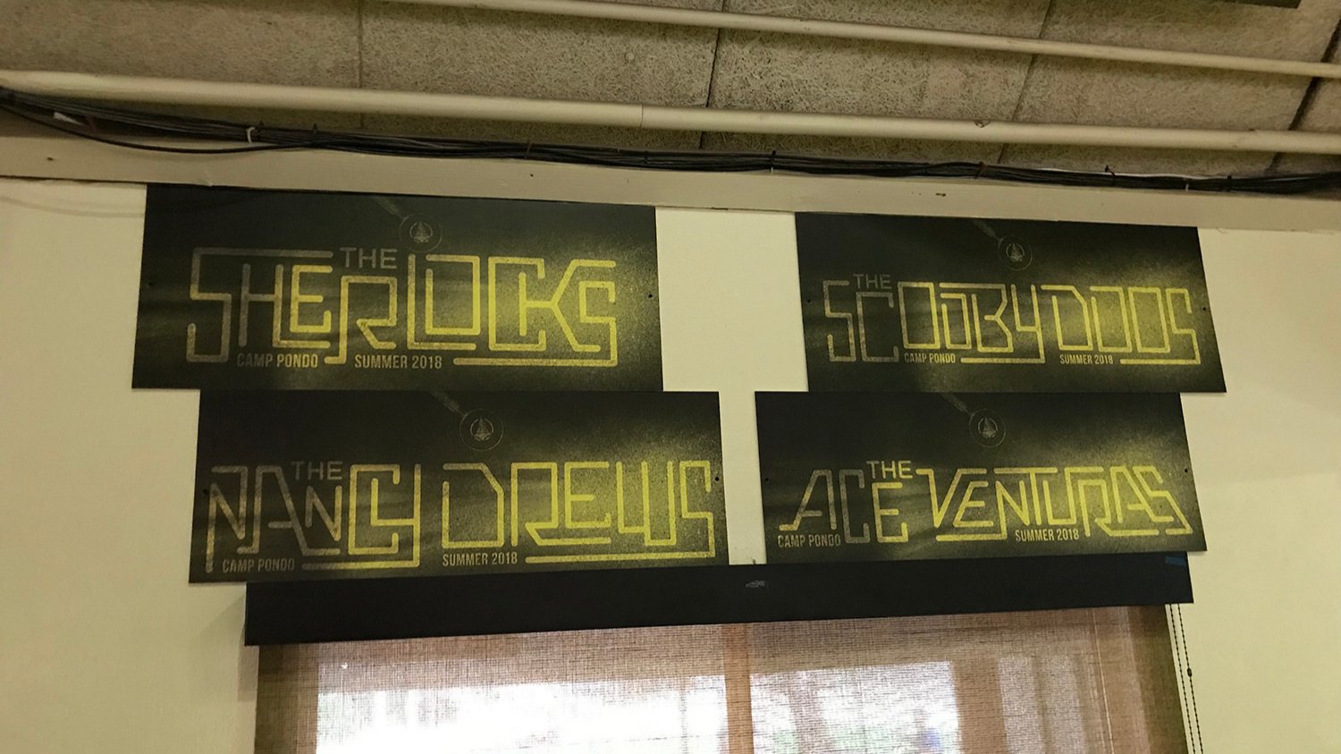
Two team word marks, each with 4 sub groups—to delineate the various groups during the competition portion of each week
Two team shirts that corresponded with the main team word marks
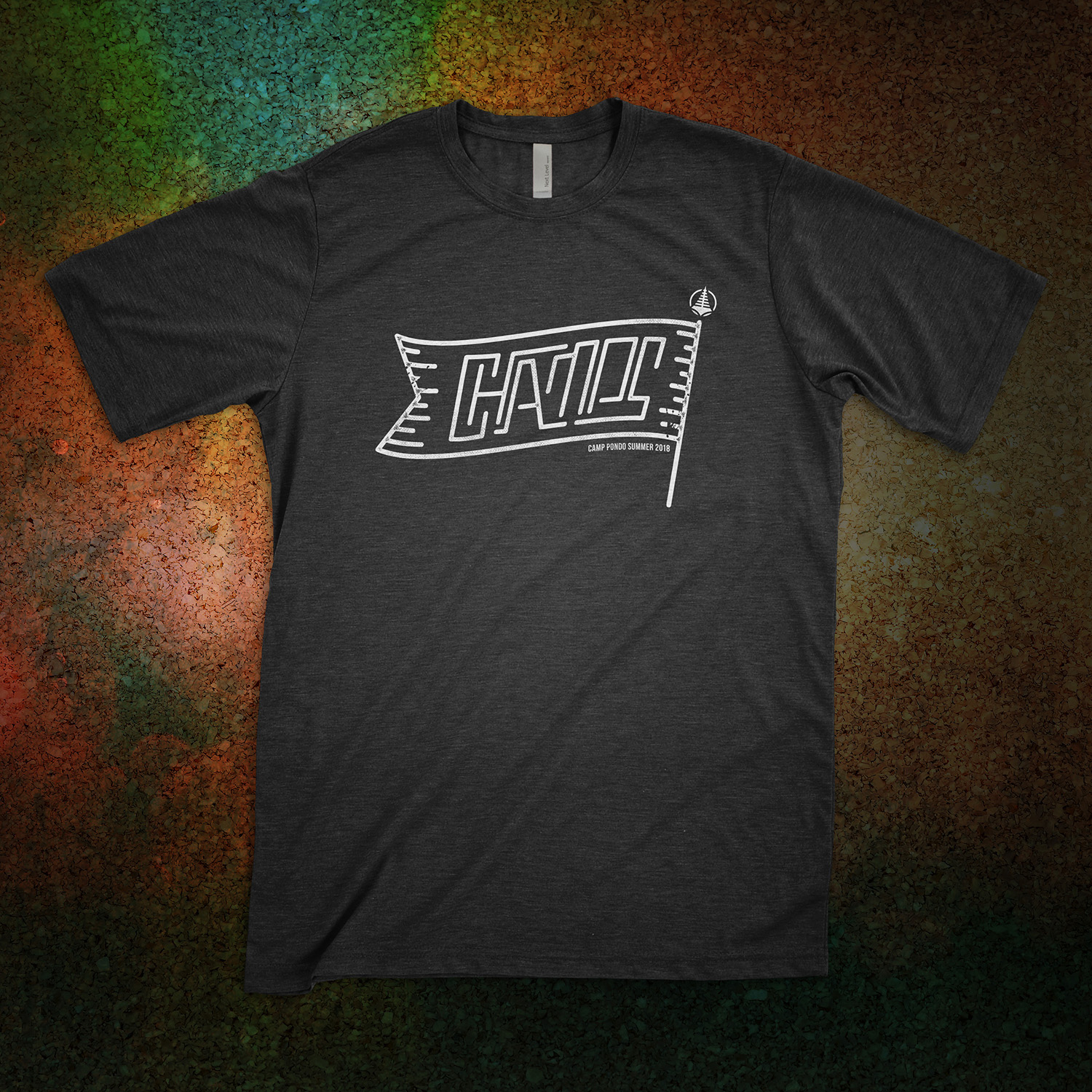
A staff shirt that could be seen from far away as clearly not being a camp guest
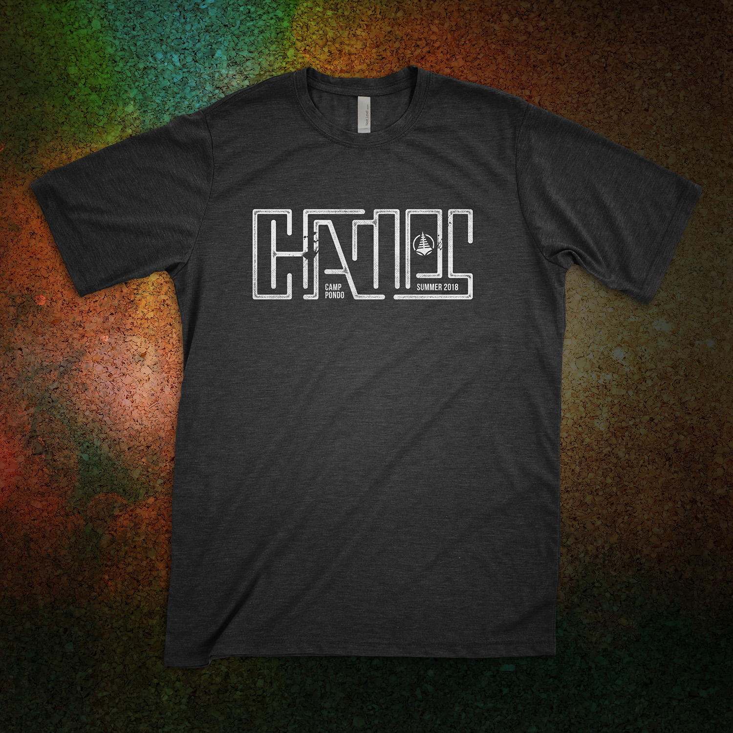
A shirt design for the team that “won” the competitions for the week they were attending
A booklet laid out with all of the camp information that guests would need while on the grounds
Team Word marks
In keeping with the detective theme, the Skippers decided on the names “Opportunity” and “Motive” for the teams and asked for green and yellow as the primary color to visually separate the two. I took the original lettering and crafted two new word marks, striving to make them visually about the same size despite the difference in character length.


Once those word marks were approved, I laid out the four sub group names for each as well. All of them were decided by Dan Skipper.

Apparel
Continuing the theme, I adapted the artwork for shirt designs. Every student at camp would be on a team and need a team shirt. Staff members would be recognized by a "Door Holder" shirt. And the subteam that won each week of the summer would receive a "Champs" shirt. I provided multiple mock-ups and final artwork for print.
Guest Booklet
The last deliverable I created for this project was a booklet for the guests arriving each week during the summer program. The interior spreads included devotional material, space for journaling, and advertisements for camp apparel, an on-site escape room, and the upcoming winter program for the camp. Several headings were custom lettered to match the "Get a Clue" style for consistency throughout. Other typefaces used include Baksoda and Bebas Neue, which had been used for earlier promotional material with a general “Summer” theme, before the detective theme was decided. Here are some of the selected spreads (click each to expand).
This project was extensive and included a lot of custom lettering, but ultimately was very well received by guests and led to several sold out weeks and a lot of bookings for the winter program. The Skippers run a great program at that camp, and I was honored to be able to add to the value through visual design.